Why Accessibility is the Coolest Kid in UX/UI Design Class
As a UX/UI designer, your job is to create beautiful, intuitive interfaces that make people want to engage with your product. But have you considered the fact that not everyone can interact with your designs in the same way? That’s where accessibility comes in.
Amber
3/30/20233 min read

Accessibility in UX/UI design refers to the ability of people with disabilities to use your product. And no, I’m not talking about the ability to use a product with your feet (although that’s definitely important too!). I’m talking about the ability of people with disabilities to access information and use technology in the same way as people without disabilities.
When we think of disabilities, we often think of physical disabilities like blindness or deafness. But disabilities can also be cognitive or neurological, such as dyslexia or ADHD. In fact, according to the World Health Organization, over 1 billion people (that’s 15% of the world’s population) have some form of disability.
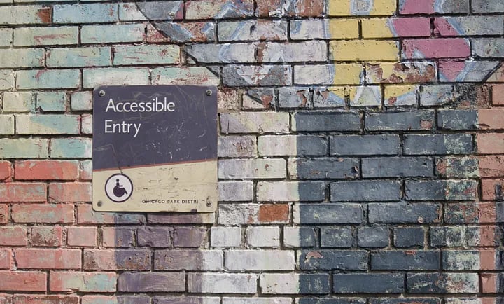
So, why is accessibility so important in UX/UI design? Well, for starters, it’s the law. In many countries, including the US and the UK, there are laws in place that require websites and digital products to be accessible to people with disabilities. But beyond that, it’s just the right thing to do. Everyone should be able to access and use technology, regardless of their abilities.
But making your designs accessible doesn’t have to be boring or difficult. In fact, there are some simple steps you can take to make your designs more accessible and inclusive.
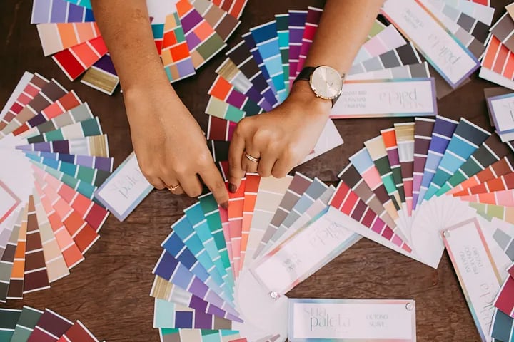
First, consider the colours you’re using. Colour blindness affects around 1 in 12 men and 1 in 200 women, so it’s important to make sure your designs are still readable and usable for people with colour blindness. One way to do this is to use a tool like Color Oracle, which simulates different types of color blindness and shows you what your designs will look like to people with those types of color blindness.
Another way to make your designs more accessible is to use clear and concise language. This is important not just for people with cognitive or learning disabilities, but for everyone. Nobody wants to read a bunch of confusing jargon or convoluted sentences. Keep it simple and straightforward, and your users will thank you.
When it comes to designing for people with visual impairments, there are a few things to keep in mind. First, make sure your designs are scalable. This means that users should be able to zoom in or out on your designs without losing any information or functionality. Second, use alt text for images. Alt text is a description of the image that can be read by screen readers, allowing people with visual impairments to understand what the image is.
But accessibility isn’t just about making sure people with disabilities can use your product. It’s also about making sure your product is inclusive and welcoming to everyone. For example, did you know that the font you choose can affect how people perceive your product? A serif font, like Times New Roman, can give your product a more traditional or serious feel, while a sans-serif font, like Helvetica, can make it feel more modern and approachable.
Finally, it’s important to test your designs with people who have disabilities. This will give you a better understanding of how your designs are actually being used, and where there may be issues. There are plenty of resources out there for finding and working with people who have disabilities, such as the Accessibility Guidelines Working Group.
In conclusion, accessibility is an essential part of UX/UI design. It’s not just the law, it’s the right thing to do.
Why not check out this article on Medium
And, if you like it, hit the follow button while you're there to keep up to date with my writing.


CONTACT
contact@amberdesign.online