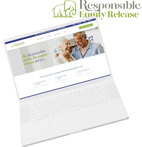
Responsible Equity Release
Website Design - UX Journey - Design System - Wireframing - Product Launch
Responsible Equity Release is a UK-based company that offers equity release solutions to individuals aged 55 and above. The company was facing two main problems with their website: low on-site conversions through the calculator and a failure to effectively communicate their key USPs. This case study outlines the approach taken by the team to redesign the website, the challenges encountered, and the results achieved.
The Objectives
Tasked with achieving three core objectives:
Increase customer engagement on page
Main problem on site is the lack of conversions through the calculator
Requires a 5% increase in on-page conversions on the equity release calculator page to meet business targets


My Role
Lead digital design / UI
UX strategy & design implementation
Project planning and launch timelines


The final product exceeded all expectations, with on-site conversions increasing to 6.3% - well above the target of 5%.
Key takeaways included:
Improving the usability of the on-site calculator led to a significant increase in conversions.
Highlighting the company's key USPs improved user trust and credibility, leading to more conversions.
The key stakeholders were thrilled with the execution, and the team continued to test and learn using user data to further improve the website in the future.
Having put time into UX research and developing a clean UI the website has seen a 25% growth in engagement with the calculator and 36% more time spent on site browsing the content.
The project was turned around in a quicker timescale due to the improved project management and tools (such as Figma) which made the whole process smoother and more collaborative.
Results
Research and Planning
The project team comprised six members in marketing, three in design, and three in development. The team conducted research using historical company data and focus groups with the target demographic to identify the main pain points of users.
Myself and the team also used insights from tools like Hotjar, Google Analytics, and VWO to gather information on user behaviour on the website. Key findings included:
Users found the on-site calculator difficult to use, which led to low conversion rates.
Users were not aware of the company's key USPs, which made it challenging to establish trust and credibility.



Team
Marketing Team (x6)
Creative Team (x3)
Dev Team (x3)
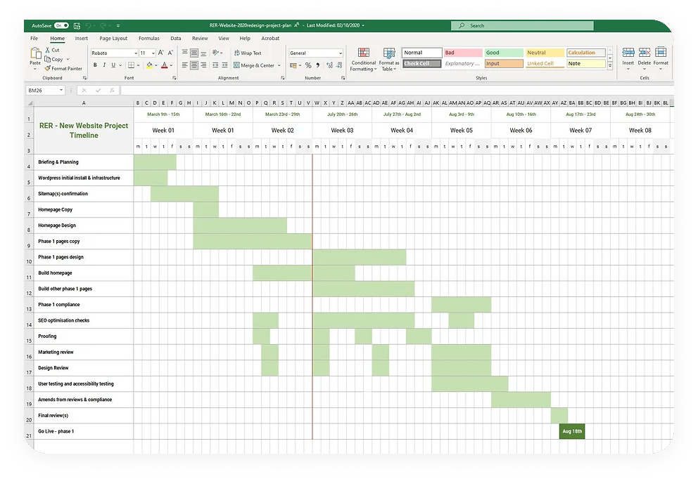
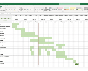
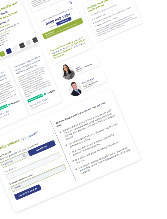
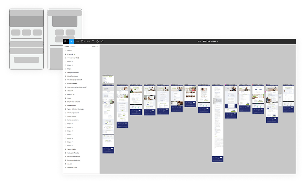
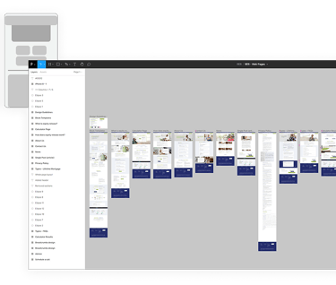
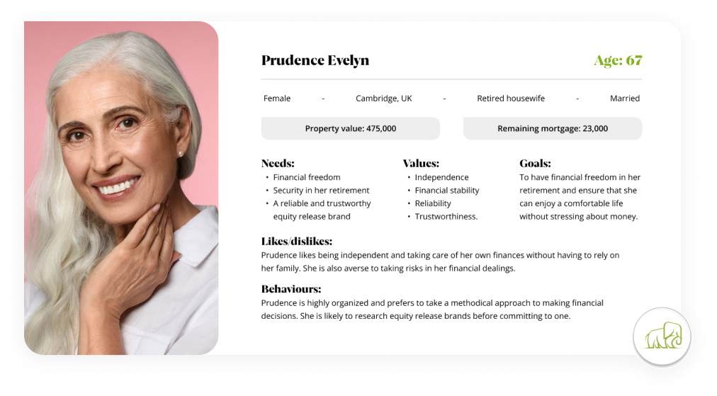
To ensure project success, a comprehensive GAANT chart was created that included contingencies to cover potential delays. User personas were developed to inform the UX design process and ensure that the redesign would meet the needs and preferences of the target audience. An atomic design approach was adopted to ensure consistency in design and ease of handover to the development team.
Design and Execution
The design framework was created in Figma, which allowed for a more efficient and collaborative design process. The website was redesigned to improve the overall user experience and highlight the company's key USPs. Some key design decisions included:
Making the on-site calculator more prominent on the homepage to improve usability.
Updating the messaging to better communicate the company's commitment to customer service and expertise.
Updating the colour scheme and typography to create a more modern and appealing aesthetic.I also paid particular attention to the mobile experience, ensuring that the website was fully responsive and accessible on all devices.
Final product
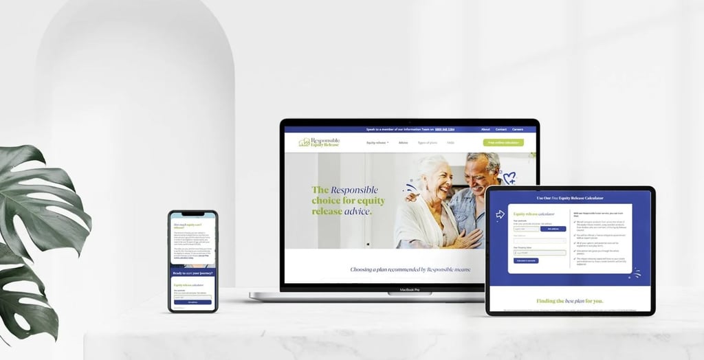
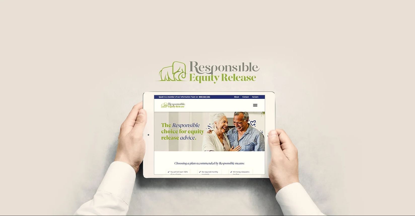
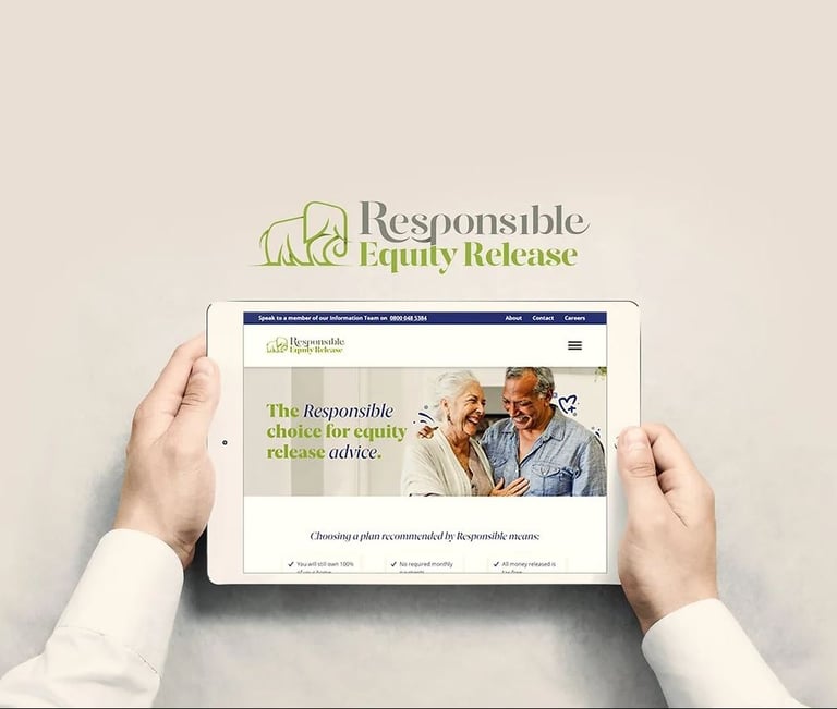
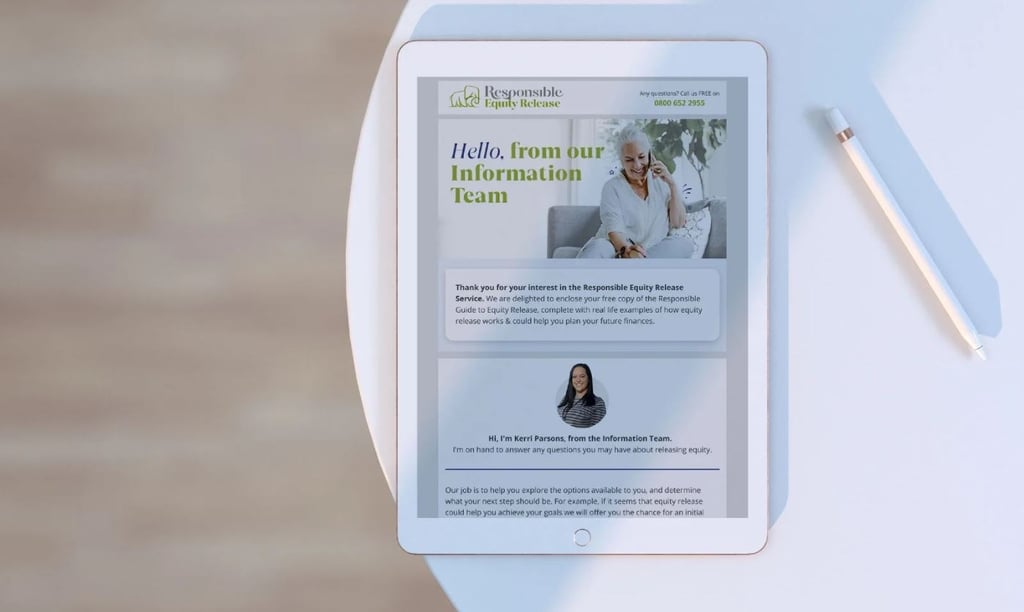
The Responsible Equity Release website redesign project successfully addressed the company's key issues and improved the overall user experience. By adopting a research-driven and collaborative approach, the project team was able to exceed the project's objectives and deliver a product that met the needs of the target demographic.
Conclusion
CONTACT
contact@amberdesign.online


